 |
  |
||
       |
|||
 |
「粉樂町」邁入第七屆,依循軌跡,粉樂町建構起的是一座無須刻意進入、沒有門票的無牆美術館,它撩動人們對於空間環境好奇的感覺神經,並讓藝術與生活在真實世界內交相發酵,進而引發撞擊、討論與交流;更重要的是它年復一年帶領觀眾重新認識我們所居住的土地,並不斷挖掘這座城市所能擁有的更多可能。 2012粉樂町推出「粉角色」(Power of color)主張,企圖由雙向思路出發,一方面秉持一貫的策展脈 「你喜歡什麼顏色?」 這是個簡單的問題,牙牙學語時,我們初次遇見這問題,卻不知道它終將圍繞自己一輩子。因為光,人類得以看見世界的樣貌,也因此能看見這星球蘊含的各種顏色,人類的感覺是認知的開端,環境中的光刺激了器官(眼睛),通過神經傳達與大腦的運作,因此我們有了感覺與認知;它是作用於人眼引起除形象以外的視覺特性,純然關於眼睛的感受,並且因為不同人與不同物種的生理構造相異性,而產生對於色彩可視性與敏銳度不同。為了達成溝通,同時暸解他人看見的顏色與自己看見的是否相同,人們甚至開始針對顏色制定標準名稱和定義,也因此更進一步構成色彩與語言詞彙上的搭疊。 |
||
對於顏色的認知,得透過後天觀察與學習,並非與身俱來。在不同鄉鎮與國土間,因為天然資源不同、太陽光射入的角度差等因素,構成了地域光線與色彩的獨特性,並直接影響各民族使用色彩的方法和習慣。顏色本質上所客觀存在的可視特性對各民族而言都是相同的,但經歷人類長程的歷史與文化發展下,各民族於顏色的認知與其背後所被賦予的喻意和聯想則有所差異。於此,顏色關於的是過往的生活方式與文化軌跡,它牽引的其實是感性層面的事情,那是人們的生活經驗、記憶與文化傳承;除此之外,在日常生活中,顏色也是具有絕佳表達力的語言,不同顏色互置並存,會產生視覺平緩和諧、衝突焦躁等歧異感受,這是為什麼顏色能在表達意義之外傳遞豐富的情緒,也是人們經常藉由顏色來抒發(或宣告)情感的理由。 童年時以畫筆塗鴉填色是許多人共通的經驗,嘗試操作手中色筆的混色堆疊,加入或輕或重筆觸,繪出曾經見過(或想像中)的顏色,這段從模糊到具體的過程便是創作的體現;在藝術史上我們見過偉大的藝術家呈現出不同的顏色感動,高更(Paul Gauguin)運用朱紅色畫出大地熱情潤澤的生命力、馬諦斯(Henri Matisse)以原色注入強烈大膽的自由奔放等,都是大眾熟知的經典。在藝術世界裡,人們可以看見藝術家對於顏色最敏銳的觀察、記錄、擬仿與創造,色彩並不會單一存在,如同交響樂曲般,或寧靜、合諧、或衝突、激烈,投射著藝術家內在情感、細膩的觀察與色感訓練,而這也是藝術之所以能動人心弦的原因之一。當其跨越畫作進入空間裝置,隨粉樂町步伐踏入生活環境時,則更能以日常的姿態,直接感染觀者的心。 這次展覽中,多位藝術家藉由色彩加乘或刪離色彩的創作手法,各自表述全然迥異的視覺遊戲與心理歸屬,透過大膽鮮豔色彩的添覆,騷動觀者視覺交感神經,海蒂‧渥特(Heidi Voet)將數千支彩色電子手錶編織成地毯,結合視覺、聲音與時間感受,以機械誤差指射在群體制度下個體不可泯除的獨立性;瑪格妲‧賽耶(Magda Sayeg)由繁複大量的編織手法用毛線包覆臺灣庶民生活常見的小吃攤車,扭轉人們對於在地文化的城市印象;吉川公野(Yoshikawa Kimiya)、蔡筱淇、袴田京太郎(Kyotaro Hakamata)靈巧運用雕塑技巧,將工業化鮮豔塑料再造為有機物體,於強韌生硬的塑料質地中注入生命;黃彥超、黃柏勳以流動的線條與噴射狀色塊作高彩度塗灑,爆發個體內在情感訊號的活躍流動。甚具年度指標意義的富邦金融中心高樓樓貼創作,今年度則由日籍藝術家岩崎崇(Takashi Iwasaki)登上版面,傳達色彩為生命豐滿的重要元素成為作品核心精神的表達。 另有部份藝術家以抽離顏色的日常形式解構視覺與思考邏輯慣性,例如賴易志的數位攝影褪去物件原有色彩,重新以純白形象再現,以一種無邊際的淨白作為意識探索的開端,企圖讓觀者在面對事物時能擁有更寬廣的詮釋空間;李佳祐抽離視覺顏色與形體線索,將意識感知回歸至記憶與生活經驗,探討存在於形而上的生命觀點;鍾順龍由紀實出發關注於環境和生活中的凝視與發現,抓取一個微小又稍縱即逝的狀態,反覆驗證著存在與不存在的爭辯。還有藝術家以記憶中的色彩來進行創作,許旆誠、鍾舜文、黃華真、瑪莉娜.克魯斯(Marina Cruz-Garcia)、劉小康等藝術家們分別由生活記憶、與人交會的深切情感,或是家族和文化根源的追尋出發,透過或立體雕塑或平面繪畫手法,書寫出綿密醇厚的情感密度。 以顏色為生活實踐,也是呼喚正視色彩的態度,從前,顏色僅是少數的尊榮,人們所能擁有與保留的有色物體有限,但在現今工業加工發達的時代,色彩的使用與保存大量普遍且易於取得,顏色滿溢於食衣住行之際,以量販的姿態存在於居住街道、空間內,我們已漸漸習慣在易於取得色彩的世界中生活;久不留心,便會陷入喪失對顏色好奇的危機,輕心迷失在過多的色彩之中。再燃對顏色的敏銳是必要的,因為懂得運用顏色早已成為人人不可獲缺的能力,在社會架構與產業考量下,顏色已由吸引、遮蔽、警告、維持安全等原始目的轉具策略價值,除了關於看見,它是辨識世界的方式,也是個體被世界識別的重要方式,有效的運用色彩計畫,將會成為影響個人、企業與城市的工具,這是顏色撼動世界的感性力量,所能影響遠遠超乎你所想像。 除了看見顏色、呈現顏色,並以此為討論和行動(展覽/行為)之外,顏色,還關乎於「選擇」,在「選擇」顏色之下,其欲表達的是該問題底層有意識或無意識的代表意義是什麼?顏色的選擇,具有軟性力量(卻是強烈的),它能以直覺但不易察覺的姿態對心理產生影響,顏色反映的是該人、團體或事物所扮演的「角色」,在語言尚未能抵達之前,便已搶先一步表達出立場與態度;這個選擇,指向身份認同,同時也是一種更直接對話於狀態背後所載負的責任義務與權力關係的方式。我們看見世界,進行選擇,以至回應世界,並同時影響圍繞在旁的人們及其所居住的城市。就如同「粉樂町」是對於城市生活的美好想像,亮眼的桃紅標誌落點東區,則是觀眾對於粉樂町的熟悉印象,熱情明亮、摩登創新且充滿活力,這是粉樂町定色的選擇,也是這個展覽行之多年與臺北東區所共構的默契。 同時,參展作品中亦有多位藝術家分別由觀察者、實踐者、或夢想者的相異角色態度出發,藉由作品延伸為心靈與客觀世界接契的平台,康雅筑、杜珮詩以旁觀的方式,一則模擬再現真實,一則運用甜美反向諷刺真實的窘境;徐永旭經由親身實踐將時間與生命揉入陶土,創造材質與身體的直接對話;豪華朗機工產製限量瓶水,由藝術贊助出發,回饋於藝術贊助之途,實際挑戰市場機制;劉文瑄、鄭秀如強調作者在場,以線性、平面、立體的繪畫手法戲耍現地視覺感;張子隆、張永達、宇治野宗輝(Ujino Muneteru)、徐瑞憲改變物件原有特性與角色,連結觀者的行為與互動,創造出截然不同於原樣的物件個性;朱盈樺、林怡芬、大江慶之(Yoshiyuki Ooe)、池田朗子(Akiko Ikeda)、徐薇蕙、劉瀚之等,以自身成長與城市經驗為基礎,藉由攝影、雕塑、編織或機械製作等手法,添賦作品予奇幻詼諧、擬仿再造的超現實性格來回應真實世界;游文富藉由手工編織大量竹片封存回憶並組構仿如境外的超現實感;而陶亞倫、戴翰泓、澤拓(Hiraki Sawa)、藝術團體似不像(Chimerik)則以光影或建築空間扭轉的模式來晃動身體直覺,抽離現實框架讓觀者投入如夢般的景境。如果藝術的本質在於回應現實,那麼透過藝術家對於現實的觀察與勞動產製的作品,就是我們回望世界處境與自身角色的最美好方式之一了。 城市的精神,是一座城市的靈魂,它來自於居住在這座城市中的人們長時間的生活方式、累積的文化厚度、歷史樣貌與其對待生命的態度。如果以顏色來形容這座城市的靈魂,臺北東區是繽紛的,五十年來它由一片荒煙漫草,轉變為時尚經濟與消費產業濃密聚集的土地,在松山創意園區落成啟動後的未來,它更是臺北文化創產厚實培植的重要基地。近二十年來,許多滿懷夢想的新世代青年,將這座城市的巷弄開嶄為關於美好生活的實踐與創造力的聚集地,他們敏銳於外來文化的刺激,也無懼於開創自我,樂於分享並能享受與挑戰共存的生活。這裡是夢想與真實交鋒的第一線,也是創意是否能成就為產業的實戰場;於此,我們相信粉樂町的持續存在,是藝術與文化轉換為經濟價值後的實踐與考驗,並瞭解於文化的培育終將滋養產業創意,效益不在於即時的金錢盈餘,而在於長期潤澤觀者(消費者)的品味後所能達到的對於更好生活方式的共識。
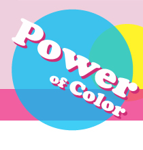
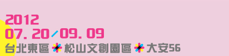
2012年的臺北東區,粉樂町落點在一幢走過繁華的洋房和它的庭院(大安路一段56號)、一條聚集新銳創意與風格生活的街道(忠孝東路四段181巷35弄與40弄)、一座具有歷史意義與未來開拓性的文化古蹟(松山文創園區-北向製菸工廠)。三處截然不同的場域,是因為擁有來自企業、街區商店與政府機構的支持,觀眾可以在這三個展區中,分別看見藝術以居所與記憶為出發的對話、潮流與消費文化的呼應,和時光流轉下對於在地工業產製的遙想。三十七位來自國際與臺灣的當代藝術家,將粉樂町作為藝術實踐的平台,維持向城市空間對話的性格,持續挑戰臺北生活的美感潛力,並透過豐富的藝術教育活動活絡社區與人際流動。旅行他方,我們總會想起自己的家鄉,在記憶中的思念來自味道,還有那些閉上雙眼後會印入眼簾的畫面,其中,將會包含什麼樣的角落、人物與色彩呢? 來吧!以如旅人般新鮮渴求的雙眼,望向你已然熟習的街道與居住的城市,做個粉角色,擁有一顆好奇好玩的心,顛覆想像踏出框架,與粉樂町一起用顏色的力量繽紛生命,品味生活中的每個美好角落吧! The power of color Curatorial statement
This year marks the seventh edition of Very Fun Park, an art museum without walls. It cultivates our curiosity towards the environment and brings art into real life, sparking collisions, discussion and exchanges. More importantly, through an ongoing process to discover new potential, the Very Fun Park inspires new perceptions of the land that we call home.
“Power of Color” is the theme for the 2012 Very Fun Park, and this theme is explored via two approaches. In keeping with the conventional approach, a dialogue between art and space marks the event’s undertone. The first approach is to identify the roles that art plays in our everyday life. It prompts viewers to ponder the interaction between themselves as individuals and the pluralistic society. The other approach is to identify the “power” hidden in every corner and use “color” as a force for action. Besides observation, response, imitation and replication, the event encourages viewers to see beyond the surface of color and character, and to consider their implications and positive forces towards life. Given cultural and ethnical differences, can color, as a potential form of language, be used as a common means of communication? Can we decipher the code behind colors? Can color affect our behaviors through visual impact? How does color change our perception of ourselves and others? How can color be used as a driving force for institutions or society as a whole?
What is your favorite color?
When we were first asked this question as toddlers, it never occurred to us that we would reencounter the same question repeatedly throughout the rest of our lives. Light reveals the world and its wonderful colors to our eyes. The light stimulates the eye, and neurons pass on the message to the brain, resulting in the feelings and perceptions that precede cognition. Light brings a unique experience limited to the eyes. Due to differences in physical buildup, humans and animals perceive colors differently. In order to communicate and understand how colors appear in other people’s eyes, some of us have begun to standardize them by naming and defining colors, pairing them with verbal expressions.
Color perception is not something we’re born with; it is acquired through observation and learning. Natural limits render sunlight to form unique colors in different locations. Yet, in essence, color is the same everywhere. It is the historical and cultural developments that provide different meanings and associations for different ethnicities. It is reasonable to believe that colors reflect the lifestyle and culture of the past. They inspire emotions embedded in experiences, memories, and cultural heritage. Colors can also be extremely expressive. A mix and match of colors create harmony and conflict at the same time. Color is a powerful language that communicates many emotions, making it ideal as a way of emotional outlet or as a way of making a statement.
All of us have drawn and painted at some point in our childhood. We experimented with colors or used light and heavy strokes, putting on paper the colors of our visual experience and imagination. The process of transforming vague ideas into solid beings exemplifies creativity. We have seen many great artists putting their imaginations on canvas. Some classic examples include Paul Gauguin’s vermillion rendition of earth’s abundant vitality and Henri Matisse’s bold passion with primary colors. Artworks present the artist’s sharpest observation, documentation, imitation and creativity. No single color can exist by itself. Like a symphony, colors can be either tranquil and constant, or conflicting and fierce, projecting the artist’s innermost sentiments, their keenest observations and most acute perceptions. This is also one of the reasons why art can be so moving. The Very Fun Park offers a transition from traditional 2D artworks to 3D art installations, making art an accessible part of our daily lives and bringing it closer to the heart.
The exhibition is a kaleidoscope of the artists’ creative methods, from a mixture of colors to a lack of colors. Using bold colors to stimulate the eyes, each piece represents a visual game or inspires a sense of belonging. Heidi Voet weaves a carpet out of thousands of electronic wristwatches. With a combination of visual, audio and time senses, the margin of error reflects the undeniable individuality in a system where uniformity dominates. Magda Sayeg covers an ordinary food cart with brightly colored yarn as an attempt to reshape our impression of the city and local culture. Artists Yoshikawa Kimiya, Tsai Hsiao-Chi, and Kyotaro Hakamata dexterously use their carving skills to transform bright industrial materials into organic objects, breathing new life into tough and rigid materials. Huang Yen-Chiao, and Huang Bo-Xun use flowing lines and huge splashes of colors to symbolize the restless emotional signals inside our bodies. This year, the gigantic building decal on the side of the Fubon Financial Building is the brainchild of Japanese artist Takashi Iwasaki. It makes a grand statement honoring the indispensible role of colors both in art and in life.
Some artists have gone the other way, stripping objects of colors, so as to overturn our usual ways of seeing and thinking. Lai Yi-Chih’s digital photography de-saturates objects, presenting them in pure white. The infinite whiteness marks the beginning of an exploration of the mind, allowing viewers to form their own interpretations. Lee Chia-Yu aims to delve into the metaphysical aspect of life by forgoing colors and shapes, forcing us to resort to memories and experiences from the past. Chung Soon-Long depicts the observations and discoveries of every life. His photographs capture the subtle and transient moments in time, engaging in an ongoing debate over presence and absence. Other artists find inspiration in memories. Hsu Pei-Cheng, Chung Shun-Wen, Huang Hua-Chen, Marina Cruz-Garcia, and Freeman Siu-Hong Lau each have a unique approach, from life memories to interpersonal attachment; from an attempt to trace family history and cultural roots, to the expression of intense emotions in sculptures or on canvas.
Color also has its practical uses in life. The exhibition refocuses on the importance of colors. In the early days, colors were a luxury enjoyed by the privileged few, as most objects were plain back then. In a time of advanced manufacturing, color has become available to the masses. Color has made its way into all aspects of our lives. It can be seen in abundance on the streets and inside houses. We are used to living in a colorful world. However, it is all too easy to lose our curiosity towards color when it is available to us at all times. As knowledge about colors has become an indispensible skill, we must rekindle our senses for color. Given the social and industrial structure, color has shifted from its original purposes of attracting, covering, warning and protecting. It has taken on new purposes and values. Color is a way for us to see the world. It is also a way for individual expression. Effective color schemes can create an impact on individuals, businesses, and cities. Colors have a mindboggling effect have a mindboggling effect on the world.
Other than seeing, presenting, talking and acting (in the relationship between the exhibition and our behaviors), colors also relate to “choice”. What are the conscious or unconscious meanings behind the “chosen” colors? The choices that colors carry are gentle yet compelling. It creates an effect on our mentality in an intuitive but subtle way. The color reflects the “role” played by a person, group or thing. It precedes verbal language in communicating a particular stance and attitude. The word “choice” refers to identity. It is also a way to express the underlying responsibilities and obligations we have. We make choices in response to the world we see; we make choices to change the people and cities around us. The Very Fun Park represents the beautiful attitude towards the city life. Its signature fuchsia-colored logo sits in Taipei’s East District. In the eyes of the visitors, fuchsia represents passion, brilliance, chic, innovation and energy. These are the reasons that have affected our choice of color. They also reflect a connection between the Very Fun Park and Taipei’s East District.
Observers, actors and dreamers form the diverse makeup of the participating artists in the Very Fun Park. Their works become a platform for the extended mind and objective world. From an onlooker’s point of view, Kang Ya-Chu reenacts reality, while Tu Pei-Shih depicts embarrassing moments in life with a sense of sweet sarcasm. Hsu Yung-Hsu’s pottery reflects the time and energy devoted into the production process, creating a dialogue between materials and body. LuxuryLogico produces a limited amount of bottled water, contributing to the art industry by way of sponsorship and challenging the market mechanism. Mia Wen-Hsuan Liu and Cheng Hsiu-Ju emphasize their own presence in the works, using lines, planes and 3D approaches to create a playful sense of perception. Artists Chang Tzu-Lung, Chang Yung-Ta, UJINO and Shyu Ruey-Shiann alter the original characteristics and roles of the objects, and makes use of viewer interaction to create completely different personality. Artists Chu Yin-Hua, Lin Efen, Yoshiyuki Ooe, Akiko Ikeda, Hsu Wei-Hui and Liu Han-Chih, base their works on self-discovery and urban experiences. The works are presented in photography, sculpture, knitting or machine-made items, adding a sense of humor and surreal imitation in response to the real world. Yu Wen-Fun creates two site-specific installations with bamboo to respond to surreal imitation in response to the real world. Yu Wen-Fun creates two site-specific installations with bamboo to respond to the idea of home, memory, and dreamy landscape. Tao Ya-Lu, Tai Han-Hong, Hiraki Sawa and the art group Chimerik go for the interaction between light and shadow or distorted architecture to shake our bodily perception. A step away from reality plunges viewers into a dream-like wonderland. If art is a response to reality, works that embody artists’ perceptions and labor would be the best way to compel us to turn and reexamine the world and our roles in it.
The city spirit originates from a way of life, culture, history, and attitude shared by the people living in the city. The spirit of Taipei’s East District is glamorous. Fifty years ago, it was a no man’s land. In a blink of the eye, it is now the central of fashion and commercial activities. The inception of the Songshan Cultural and Creative Park has further promoted the district into a special development zone for the cultural and creative industry. In the past twenty years, many aspiring young people have transformed the area into a place where the good life and creativity can be realized. These people never fail to pick up the slightest whiff of the latest trend. They are not afraid to reinvent themselves. They are selfless and thrive on challenges. Taipei’s East District is the frontier where dreams meet reality. It is also a testing field where innovators make creativity an industry. To give the Very Fun Park a lasting presence requires the effort to generate economic value from art and culture. It is a major endeavor in itself. It is our belief that when the society values culture, a creative industry becomes palpable. Here, values lie not in the immediate profit but in a continuous process of cultivating good taste among consumers, so they will desire better lifestyles.
The 2012 Very Fun Park takes place in different locations in Taipei East District: in a mansion with stories (56, Sec.1 Da-an Rd.); on a trendy street known for its boutiques exhibiting new ideas and lifestyle (Aly. 35 & 40, Ln 181, Sec.4, Zhongxiao E. Rd.); in a cultural heritage that is rich in history and unearthed potential (North Factory in Songshan Cultural and Creative Park). The three sites are made possible through the support from businesses, local shops and government agencies. Visitors can experience the dialogue between a residential home and its memories, the interaction between fashion and consumption, as well as the reminiscence and its memories, the interaction between fashion and consumption, as well as the reminiscence for local industries that have faded in time. The Very Fun Park offers a platform for thirty-seven modern artists from both Taiwan and around the world to flex their creativity. It is a place where artists can interact with the city, stretch the aesthetic boundaries, and interact with the locals via art programs. As travelers, we have felt homesick at some point in our journeys. We crave the familiar smell and flavor of our home. We long for the images that are only visible when we close our eyes. What do we see—What corner, faces or color?
Come and look at the familiar streets and city with a traveler’s curiosity. Take a look at the place you know like the back of your hand. Become curious and playful and let your imagination be your guide. Think outside the box. Join Very Fun Park to enrich your life and savor the beautiful things that surround you.
|
|||